ZPower
From hearing aids to consumer electronics: developing an cross-industry brand with impact.
-
Branding, Art Direction
-
ZPower
-
Modo Modo Agency
Project Overview
ZPower, a global battery manufacturer, has been a leading player in the hearing-aid business for years. As part of their new go-to-market strategy, they were looking to expand into the Consumer Electronics market. In order to bridge the two markets, the company needed to pivot their messaging approach and update their visual brand across channels.
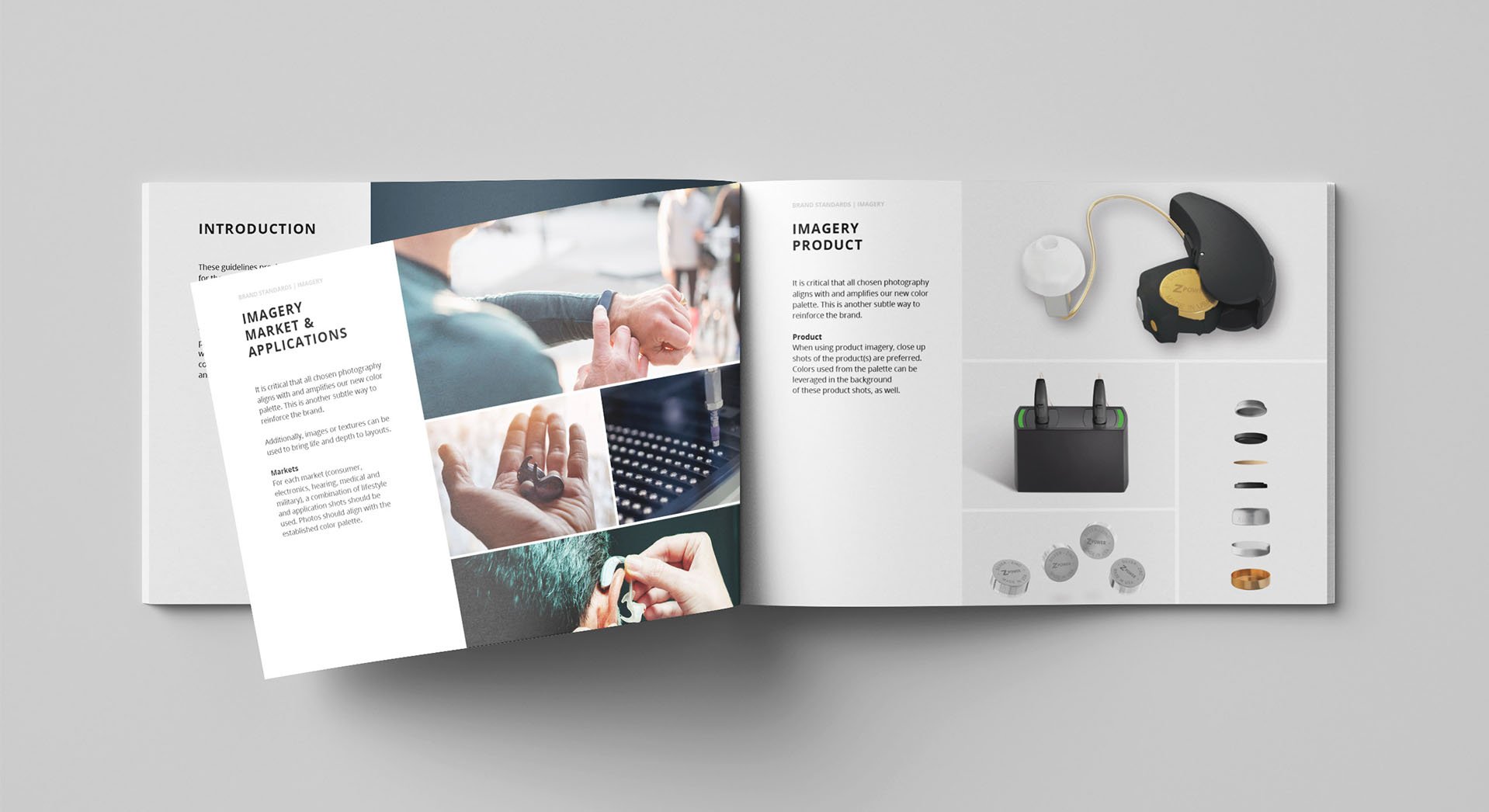
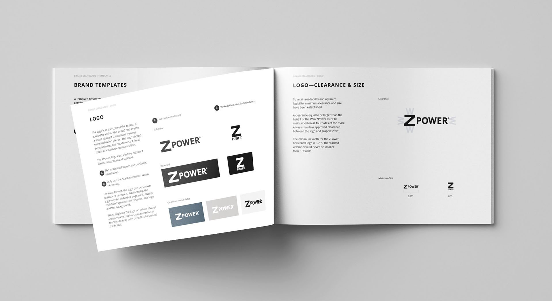
To position ZPower as a more sophisticated, and sleek consumer-friendly brand and a credible peer among a higher caliber of partners, competitors, and customers, we developed a new brand system that helped the company appeal to different audiences in a more cohesive and reliable way. The system also helped ZPower align internal departments and create excitement around new opportunities.


A web refresh
As part of the brand refresh, we updated the company website. We developed a new information architecture, UX hierarchy and found new ways to highlight the uniqueness of the brand through creative copy and human visuals.


